.design11 October 13:37
0<
The Most Common Web Design Mistakes in 2024 and How to Avoid Them
/>Discover practical tips on improving typography, navigation, and mobile responsiveness to create a site that truly engages your audience.

Share
Author  The Cymes Team
11 October 2024The Cymes Teamrelated articles


.design18 April 09:57
Designer = entrepreneur? How designers become funders of no-code projectsDesigners are turning their ideas into real digital products—without developers or outside investors. Learn how no-code tools are helping them build, fund, and grow their own startups from scratch.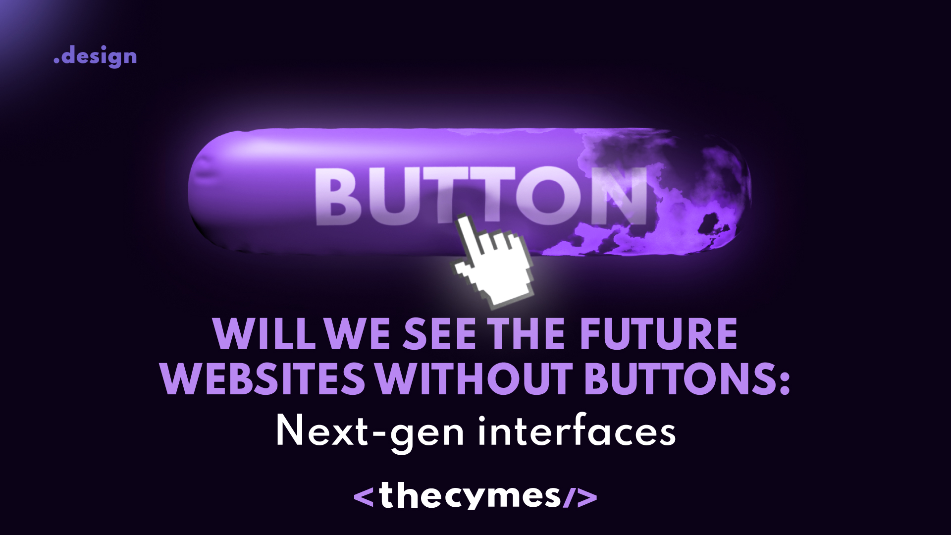
.design8 April 15:22
Will we see the future websites without buttons: Next-gen interfaces What will be the future of web design in 2025? Let's figure it out in our latest article!
.design4 April 10:20
A future without websites? Why design is shifting to mobile appsWill you make a switch to app in 2025? Is it worth it? Let's explore together in our latest article! be updated on the latest tech newsGet exclusive news updates and overview on tech market