Table of Content
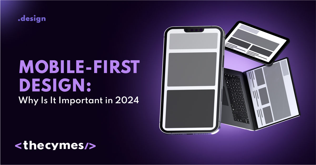
Mobile-First Design: Why Is It Important in 2024?
/>Want to learn more about making your site mobile-awesome? Check out our latest article!Introduction
As the years go by, with more and more people using mobiles, the only way businesses can sustain web and app designs is to make them fully compatible with mobile users. So, this all gave rise to a very important strategy known as Mobile First Design, through which user experiences work smoothly on each device. This article will explain what exactly Mobile First Design is, its pros and cons, and why it is needed for businesses to enact immediately.
What is Mobile First Design?
Mobile First Design is a philosophy of design where a designer first creates a website or application for mobile devices and then adapts it to larger screens such as desktops and laptops. In other words, it means creating the most basic screen first and optimizing all key features and functionalities for mobile users. Since more people started using smartphones to get content, following a Mobile First approach has become both strategic and crucial.
The Difference Between Mobile First Design and Responsive Design
Though both Mobile First Design and responsive design aim to bring improvements in the viewing experience on devices, they vary much in their approach.
The Responsive Design involves creating a version of a website that would adapt to different screen sizes; it takes the typical course of action of building a desktop version first before scaling the design down for mobile devices.
On the other hand, Mobile First Design works its way from mobile upwards to big screens. Here, the designer's approach is on simplification and optimization for mobile in such a way that users can access the most important elements without interference with extra stuff.
Why is Mobile First Design Important?
Image By FreePik
The shift towards Mobile First Design is not just a trend; it reflects changing user behaviors and expectations. Recent statistics indicate that over 50% of internet traffic now comes from mobile devices.
Right now people are relying on their phones for browsing and shopping, so those businesses which prioritize mobile design will be better equipped to attract these users. By adopting a Mobile First strategy, companies can ensure that their websites and apps are optimized for the devices most consumers use.
The most important in mobile-first design is the need to keep the design simple for the user. Designers using this approach immediately pare down features and avoid irrelevant elements that may deter or confuse users. This naturally leads to better load times, easier navigation, and more intuitive interfaces-all of which result in increased user satisfaction.
Search engines, such as Google, give priority to mobile-friendly websites. Therefore, businesses operating on the principle of Mobile First will definitely see themselves ranking higher in search engines, consequential in increased visibility and organic traffic. Indeed, Google has commented that its algorithms give precedence to mobile-optimized sites, making this an effective strategy in terms of SEO.
A well-thought-out mobile experience can greatly increase conversion rates. When users can easily navigate to a site and take the desired actions, they will convert better. Also, Mobile First Design decreases friction, hence allowing users to achieve goals in less time.
Therefore, with Mobile First Design, companies are able to differentiate themselves from their competitors that have not taken up the challenge. Quite evidently, a better mobile experience ensures more conversions, builds brand loyalty.
Key Elements of Effective Mobile First Design
To successfully implement Mobile First Design, businesses need to focus on several key aspects. Since mobile devices have limited screen space, the navigation should be very simple and easy to use. Considerations include intuitive icons, and clear labels that help users perform specific actions. This approach allows users to quickly find what they need without unintended clicks.
Mobile users are often on the run, so even a one or two-second delay can make a big difference. It's essential to optimize images, minify scripts, and use any available techniques to deliver content as quickly as possible. Tools like Google's PageSpeed Insights can help identify areas for improvement.
In Mobile First Design, it's crucial to remember that users interact with touch screens rather than clicking on links and buttons. Clickable elements should be large enough for easy tapping, and interactive items should be spaced apart to prevent accidental selections.
When you design for mobile, prioritize displaying important content first. It should be the first thing users encounter without needing to scroll extensively. This may require a complete rethinking of the content structure and layout.
While Mobile First Design emphasizes mobile optimization, it's also vital to ensure that elements scale well for larger screens. As users transition to tablets or desktops, the site should remain functional and visually appealing.
Challenges of Mobile First Design
Despite all the pros, there are some challenges associated with the implementation of Mobile First Design.
It is hard to reverse for so many designers that have been practicing desktop-first approaches. It means a rethink of traditional design processes and placing the needs of mobile first. Designing for mobile, basically, means designing on a smaller screen. Already, one big challenge is how to fit all needed content and functionalities on it without making this overwhelming for the user. Designers need to become really picky while selecting the elements that are truly needed on mobile.
Testing a website on these many screen sizes and different operating systems is an uphill task that may turn out to be pretty unpredictable; extensive testing will be highly required to locate bugs or issues and then remove them.
Successful Examples of Mobile First Design
TED
TED's mobile website is what you would call true perfection for Mobile First Design. Immediately after landing on their website, users see a clean layout of the top talks and clear navigation. The website has prioritized content that users would want to consume, ensuring popular and relevant videos can be accessed with ease.
Airbnb
This Airbnb mobile application keeps the simplicity and usability in doing searches for places to stay and completing the booking process. Seamless applications usually mean more user satisfaction when intuitive touch gestures are incorporated.
For that, the core design of Instagram needs to be mobile-first, which will help them to aid the needs of users who use it mainly through smartphones. From layout, feature, and functionalities-all are tuned for mobile use in nature, making this app one of the most popular social media across the world.\
How to Make Mobile First Design
Image By FreePik
Here’s how any business can successfully adopt Mobile First Design. Start by researching mobile usage trends and understanding your audience's preferences. This insight will guide your design choices to enhance the user experience. Identify the features and content that matter most to users, ensuring these elements are prioritized on mobile before considering larger screens.
Develop functional prototypes specifically for mobile. Use wireframes and mockups to visualize how users will interact with your design on mobile devices, and continue refining it throughout the development process.
Conduct thorough testing across various devices and screen sizes. User testing is crucial; gather feedback, iterate, and make improvements to enhance the user experience with each iteration.
After launching, keep an eye on engagement and performance metrics. Utilize analytics tools to monitor how users interact with your mobile site or app, allowing you to make data-driven decisions for ongoing optimization.
Conclusion
Mobile First Design is more than just a trend; it’s a vital strategy for modern businesses. By prioritizing mobile users, companies can enhance their online presence and user experience, ultimately boosting conversion rates. With the rise in mobile traffic, investing in a Mobile First approach is likely to lead to significant success in the future. Embrace this transformative design philosophy to help your business flourish!