WE INVITE ALL TALENTED AUTHORS TO JOIN OUR COMMUNITY🤗 ADD YOUR PUBLICATION AND TAKE THE FIRST STEP TO A WORLDWIDE AUDIENCE!
homeblockchainentrepreneurshipdesigngameshealthit/techbusiness venturetech
search

Table of Content

Responsive design + SEOWhat is responsive design?Why is it important for different industries?The impact of responsive design on SEO1. Priority for search engines2. Improved page load speed3. SEO-friendly URLs and site structure4. Keyword optimization and Core Web VitalsThe impact of responsive design on conversions5. Improved user interaction6. Reduced bounce rate7. Increased brand trust8. Optimized content for mobile usersChallenges of responsive designExamples of successful companiesRecommendations for implementing responsive designFinal thoughts
.design21 February 13:04
6 min
<

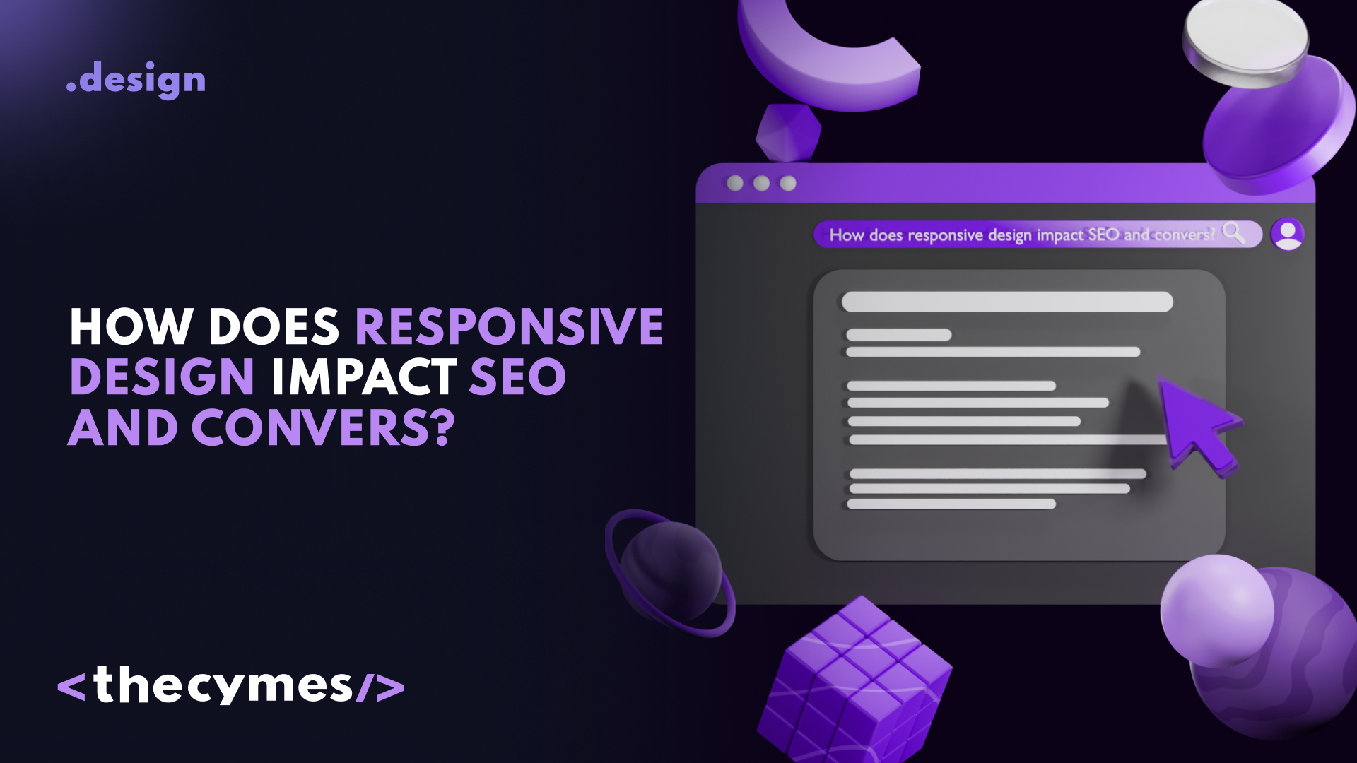
How does responsive design impact SEO and conversions?

/>
How does responsive design impact SEO and conversions?  coverLearn more about the impact in this article!

Responsive design + SEO

In today's digital world, where mobile devices occupy a central role in our lives, responsive web design has become an integral part of a successful online strategy. It not only enhances user experience but also significantly impacts SEO and conversions. In this article, we will explore in detail how responsive design can improve your website's visibility in search engines and increase its effectiveness, complete with vivid examples, interesting facts, and practical recommendations.

What is responsive design?

Responsive web design (RWD) is an approach to creating websites that ensures they display correctly across various devices and screens. This allows users to easily interact with your site, regardless of whether they are using a smartphone, tablet, or desktop computer.

Why is it important for different industries?

  • E-commerce and Retail: Mobile shopping continues to grow, and a poorly optimized site can lead to lost sales.
  • SaaS and Tech: Users expect seamless experiences across all devices when interacting with software platforms.
  • Healthcare and Digital Health: Patients and professionals need quick access to information, appointments, and reports.
  • Logistics and B2B: Easy navigation and accessibility help streamline operations and improve customer relations.

The impact of responsive design on SEO

1. Priority for search engines

Search engines like Google prioritize websites optimized for mobile devices. In recent years, Google has implemented the "mobile-first indexing" algorithm, which means it first analyzes the mobile version of a site before the desktop version. This makes responsive design a key element of any SEO strategy.

In 2023, over 60% of global web traffic came from mobile devices, emphasizing the necessity of mobile-friendly design for better SEO rankings.

2. Improved page load speed

Page load speed is a crucial ranking factor. Responsive sites generally load faster on mobile devices due to optimized images and code. Slow-loading pages can lead to high bounce rates and, consequently, lower positions in search engine results.

One company optimized its webpage by compressing images and minimizing CSS and JavaScript. As a result, load time decreased from 5 seconds to 2 seconds. This not only improved user experience but also contributed to higher rankings in search results.

3. SEO-friendly URLs and site structure

Responsive design allows for a single URL to be used across all devices, simplifying indexing for search engines. This prevents content duplication and enhances site structure, positively affecting SEO.

A company that used different URLs for its mobile and desktop versions faced content duplication issues. After switching to responsive design, they resolved this problem and improved their search rankings.

4. Keyword optimization and Core Web Vitals

With responsive design, it is easier to optimize content for keywords. You can create pages that best meet user queries, leading to higher satisfaction and, consequently, better search positions.

Additionally, Google's Core Web Vitals (LCP, FID, CLS) now play a key role in SEO. A well-optimized responsive design helps improve:

  1. LCP (Largest Contentful Paint): Faster loading of main content.
  2. FID (First Input Delay): Improved interactivity.
  3. CLS (Cumulative Layout Shift): Stable layout without unexpected movements.

A company conducted thorough keyword research and integrated these keywords into the responsive content of its site. This resulted in a 40% increase in traffic over several months.

The impact of responsive design on conversions

5. Improved user interaction

Responsive design provides a user-friendly interface and navigation, increasing user satisfaction. The easier users find the information they need, the more likely they are to take a desired action—whether that’s making a purchase, subscribing to a newsletter, or filling out a form.

After switching to responsive design, an online retail company noticed a 25% increase in conversions. This boost was attributed to improved navigation and ease of use on mobile devices.

6. Reduced bounce rate

If users cannot properly view a site on their device, they will quickly leave. Responsive design helps retain users by lowering bounce rates. A low bounce rate also positively affects SEO, as search engines consider it an indicator of content quality.

After implementing responsive design, a company observed its bounce rate drop from 60% to 30%. This led to increased time spent on the site and growth in repeat visits.

7. Increased brand trust

Websites with responsive design appear more professional and modern. This creates a positive impression among users and enhances trust in your brand. Users are more likely to return to your site and recommend it to others.

A company that updated its website using responsive design noticed an uptick in positive reviews and recommendations. This contributed to a stronger market reputation and increased client numbers.

8. Optimized content for mobile users

Responsive design allows for effective content adaptation across various devices. Well-thought-out content helps convert users into customers. For example, mobile devices benefit from shorter text, optimized visuals, and clear CTAs.

Challenges of responsive design

While responsive design offers numerous benefits, there are also challenges to consider:

  • Development costs: Initial implementation can be costly, especially for large-scale sites.
  • Performance optimization: Ensuring fast load times on all devices can be complex.
  • Testing across devices: Requires extensive testing with tools like BrowserStack, Google Mobile-Friendly Test, and PageSpeed Insights.

Examples of successful companies

Many companies have successfully implemented responsive design and witnessed positive results:

  1. Amazon and eBay emphasize fast, mobile-optimized experiences to enhance conversions.
  2. News sites like The New York Times have adopted responsive design to improve readability across devices.
  3. SaaS platforms like HubSpot use responsive layouts to ensure seamless user experiences.

Recommendations for implementing responsive design

If you have not yet adopted responsive design on your website, here are several steps to help you get started:

  • Analyze the current state of your site: Assess how your site appears on various devices and identify major issues.
  • Conduct a usability audit: Check how easily users can navigate your site on mobile devices. Use usability tools to gather feedback.
  • Update content: Ensure your content is tailored for mobile devices. It should be concise and easy to read.
  • Optimize images and code: Compress images without sacrificing quality and minimize CSS/JavaScript for improved loading speeds.
  • Test across devices and browsers: Use testing tools to analyze performance on different screens.
  • Monitor Core Web Vitals: Track Google's Core Web Vitals metrics and improve LCP, FID, and CLS scores.

Final thoughts

Responsive design is an investment in the future of your business. It not only improves user experience but also delivers tangible results in terms of higher conversions, lower bounce rates, and improved SEO rankings. Don’t miss the opportunity to make your site more effective and appealing to users, as this could be the key to your success in the digital world.

Share
Author The Cymes Team logoThe Cymes Team
21 February 2025
AI design toolsColor Choices in Designdesign insightsTypography in Web DesignUser Experience DesignWeb Design Mistakestrendy designDiversifying revenue streams globally
related articles
A future without websites? Why design is shifting to mobile apps cover
.design4 April 10:20
A future without websites? Why design is shifting to mobile appsWill you make a switch to app in 2025? Is it worth it? Let's explore together in our latest article!
Designer = entrepreneur? How designers become funders of no-code projects cover
.design18 April 09:57
Designer = entrepreneur? How designers become funders of no-code projectsDesigners are turning their ideas into real digital products—without developers or outside investors. Learn how no-code tools are helping them build, fund, and grow their own startups from scratch.
Will we see the future websites without buttons:  Next-gen interfaces  cover
.design8 April 15:22
Will we see the future websites without buttons: Next-gen interfaces What will be the future of web design in 2025? Let's figure it out in our latest article!
be updated on the latest tech newsGet exclusive news updates and overview on tech market
privacy policyterms of use
© The Cymes 2025
explorehomeblockchainentrepreneurshipdesigngameshealthit/techbusiness venturetech
the cymesabout ussupport the teambecome a partnerapply to be an author
team@thecymes.com
Follow us on social media
privacy policy/terms of use/© The Cymes 2025